Background
Running a DOOH campaign the traditional way was painful. Advertisers negotiated over email, chased creative assets manually, and coordinated with vendors just to get an ad on a screen. No central platform. No real time control. No easy way to track performance. Carter already had a strong foundation for digital advertising. My job was to extend it into the physical world without disrupting what advertisers already knew.
Traditional DOOH
Programmatic DOOH (Carter)
Manual negotiation through email and vendor contracts
Roles and responsibilities
My Role & Process
This was a four person team. Two PMs, one developer, and me as the sole designer. We had one month to go from zero to a fully functional DOOH platform.
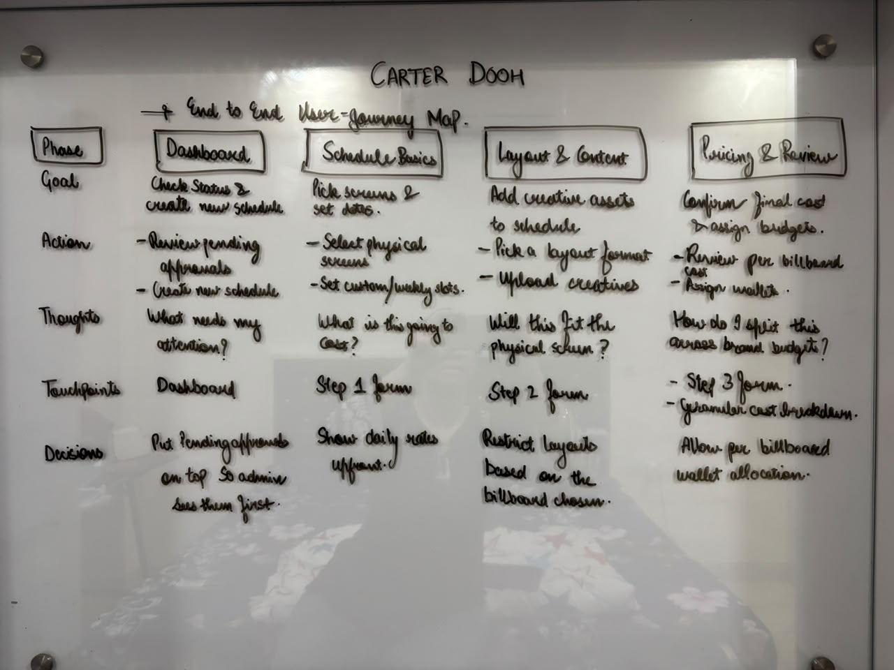
My responsibility covered everything on the design side. I mapped out the user flows, designed every screen, and delivered complete prototypes so the developer had a clear reference at every stage. I stayed close to the build throughout, sitting with the developer regularly to understand what was technically feasible and making sure design decisions survived implementation.
The biggest constraint was time combined with no direct access to users. I could not run usability tests or validate decisions through real advertiser feedback. Every design call had to be made on the basis of the PRD, conversations with the PMs, and my own understanding of how advertisers think and work. That pushed me to rely heavily on established patterns, keep flows intuitive, and make sure nothing required explanation to use.
INDUSTRY RESEARCH
Before designing anything, I needed to understand how DOOH actually worked as an industry. I had not designed for out of home advertising before, and the workflows looked very different from the digital ad world I was used to. I spent the early part of the project reading through industry research, studying existing platforms, and mapping the gaps between what advertisers needed and what current tools provided.
The traditional DOOH process was almost entirely manual
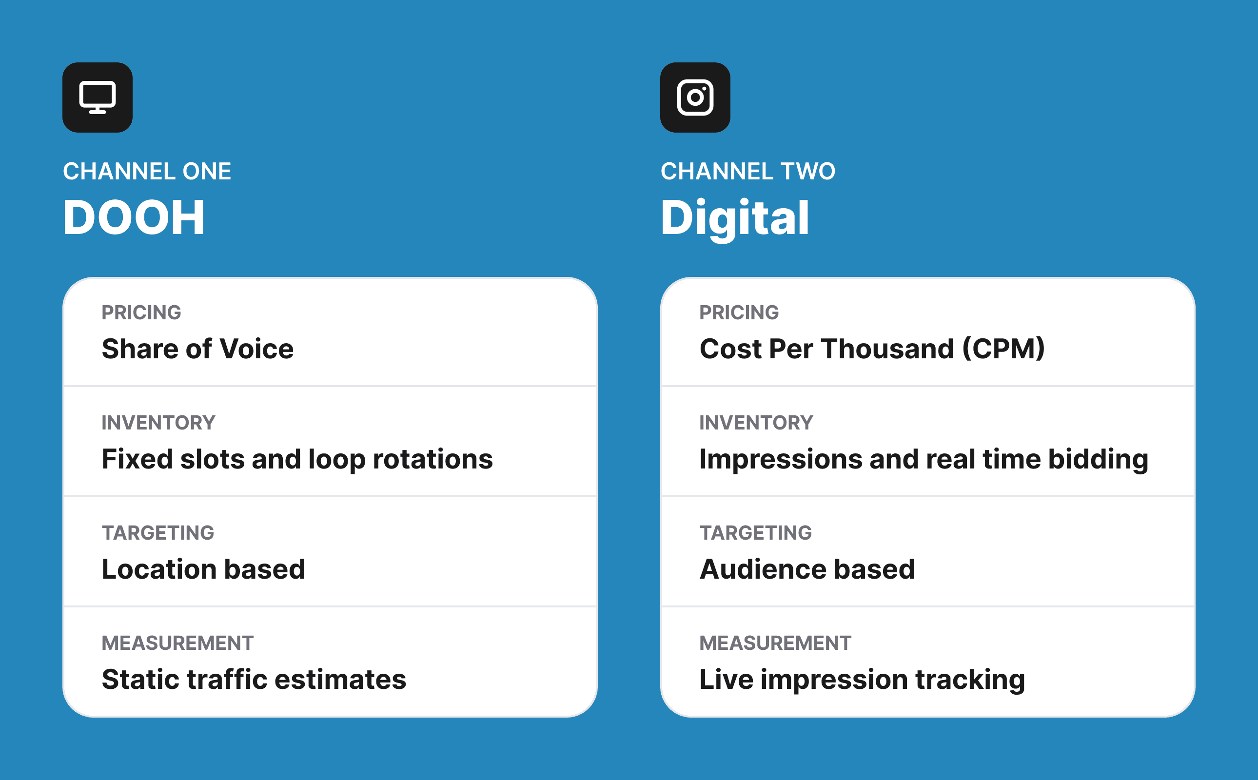
The disconnect was not technical, it was operational
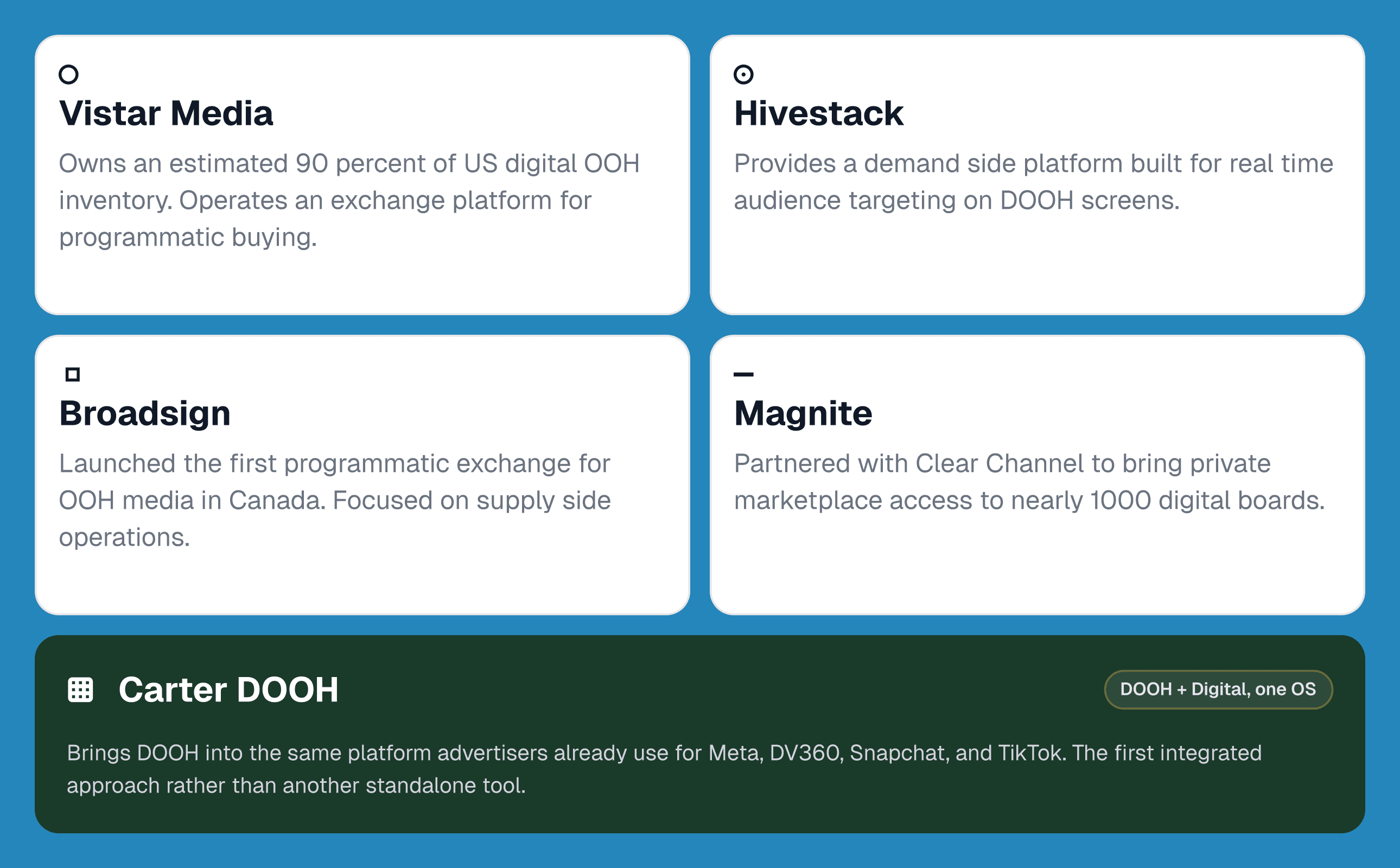
Existing platforms solved parts of the problem, not all of it
What this told me about the opportunity
What I worked on
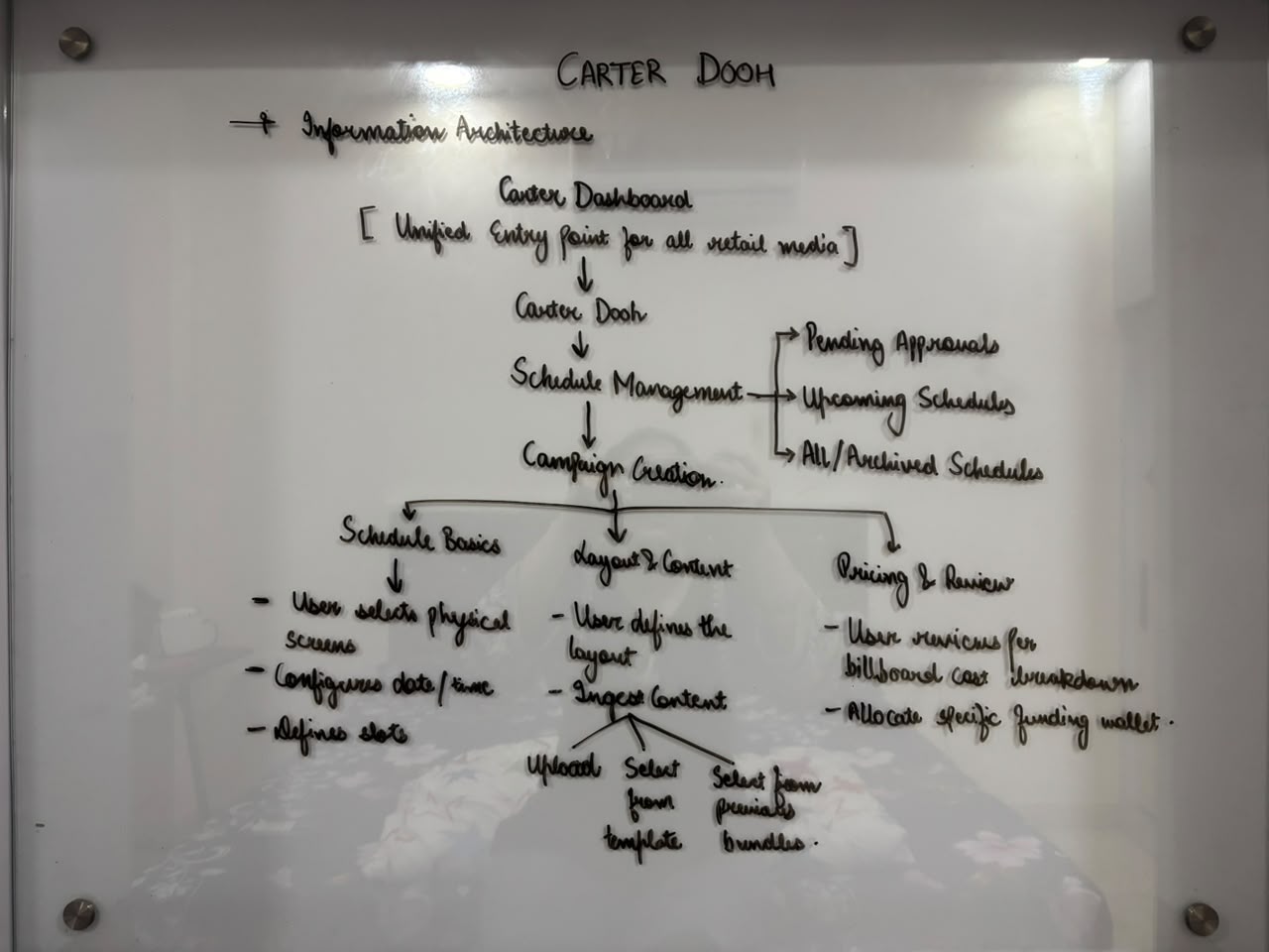
Scheduling was the most complex part of the product to design. Different advertisers come in with completely different intentions. The challenge was designing one flow that handled all of that without making the simple cases feel complicated.
How I structured the flow so advertisers always knew where they were
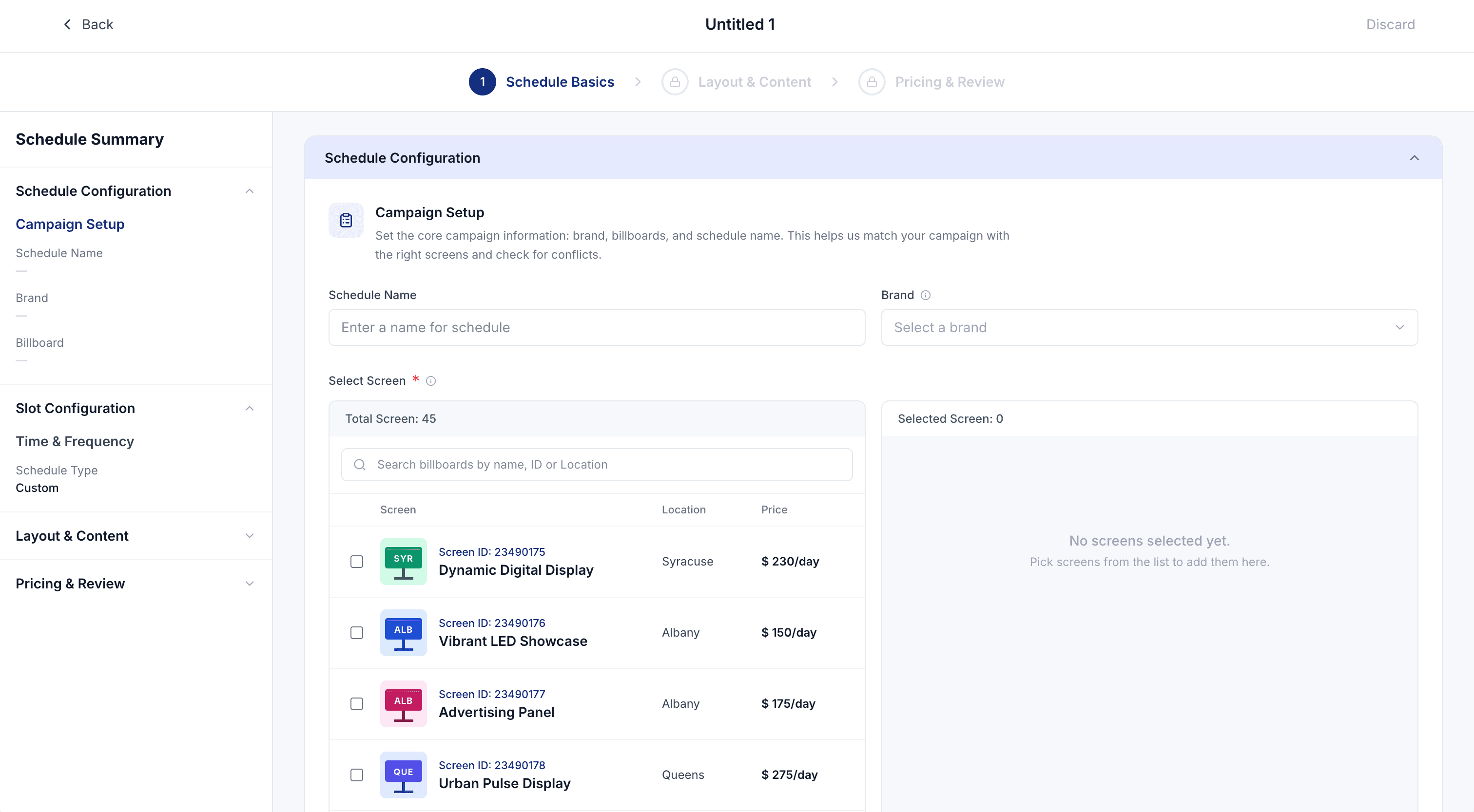
The scheduling flow had a lot of fields. Screens, dates, times, content, layout, pricing. Putting everything on one page would have been overwhelming.
I broke it into three steps. Schedule Basics, Layout and Content, Pricing and Review. Each step depends on the one before. You cannot pick a layout without knowing your screens. You cannot calculate pricing without your time blocks.
I also added a sidebar that fills in as the advertiser works. They can click any section to jump back and edit, without walking through the steps again.

How I handled pricing across the entire experience
DOOH campaigns can get expensive. Most platforms hide pricing until the last step. I wanted advertisers to see prices upfront so the review step never felt like a surprise.
In the screen selection step, every screen shows its daily rate right next to it. Advertisers know the cost of each screen while they are picking.
The review step goes deeper. Each billboard shows slot type, hourly rate, total, and the wallet being used. The wallet detail matters because Carter is built for retail media networks, where a single campaign can be funded by multiple brand budgets at once.

Giving advertisers three ways to bring content into a campaign
Not every campaign needs new creative. Some advertisers reuse content from previous campaigns. Some work from brand templates. Some upload fresh assets for the new run. The content step supports all three workflows so the experience adapts to the campaign instead of forcing the advertiser into one path.
Making approval status always visible
Every schedule needs admin approval before it goes live. This creates a problem. The advertiser submits and then has no idea what is happening.
I put pending approvals at the top of the dashboard so they are the first thing the advertiser sees. Every schedule also has a color coded tag. Green for active, yellow for pending, orange for upcoming, gray for archived.
This way the advertiser always knows where their campaign stands, without clicking into anything.
Outcome
The platform shipped on time. One month from start to finish. Four people. Zero direct user access. A fully functional DOOH management system built on top of Carter's existing infrastructure.
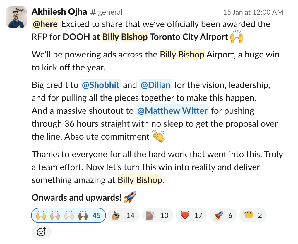
Shortly after the build wrapped, the team was awarded the RFP for DOOH at Billy Bishop Toronto City Airport. Carter DOOH is now powering ads across one of Canada's most premium travel hubs, used by real advertisers running real campaigns.

Reflection